European Society
of Cardiology
Brand Guidelines
The Challenge
The European Society of Cardiology needed a comprehensive set of brand guidelines that could bring greater consistency to a large, complex organisation while still allowing its many Associations and communication channels to retain their own character. The task was not simply to document existing rules, but to establish a practical visual system that could be applied confidently across print, digital, social, presentations, events and motion.
The Solution
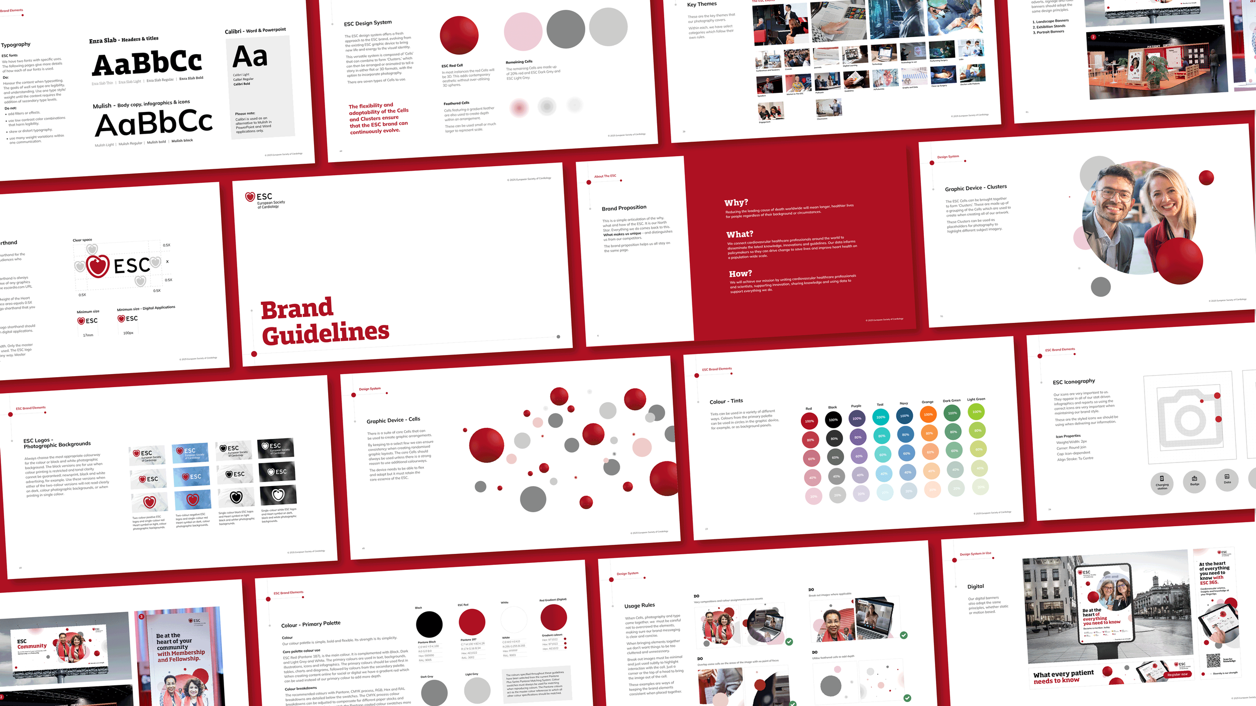
I established and developed a 168-page brand guideline document that brought the ESC identity into one coherent system, covering brand narrative, tone of voice, logo usage, colour, typography, iconography, photography and real-world applications. At the centre of the refresh was a flexible graphic language built around “Cells” and “Clusters” - a modular device that could vary in scale, density, imagery and composition while retaining a recognisable ESC signature.
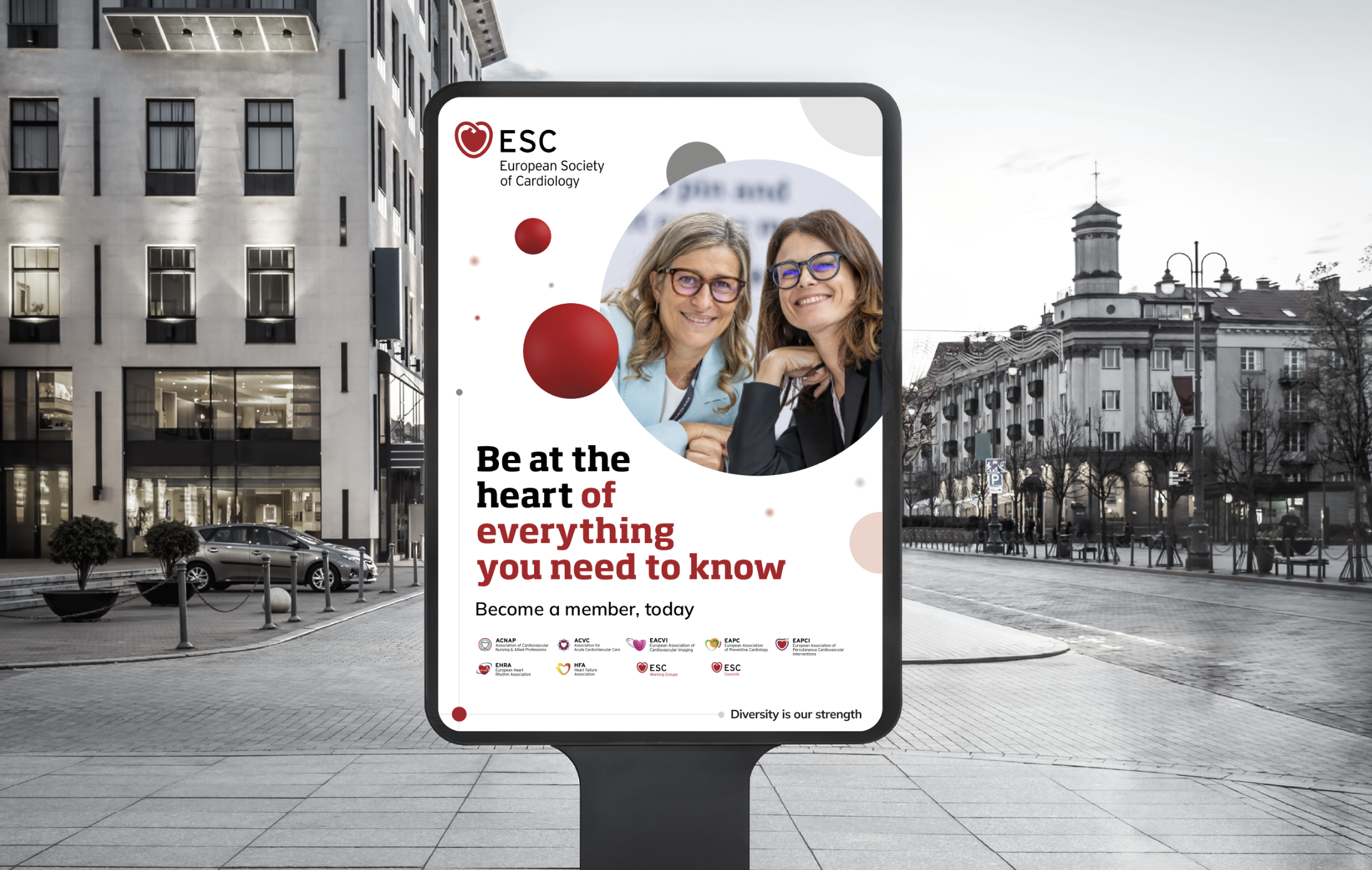
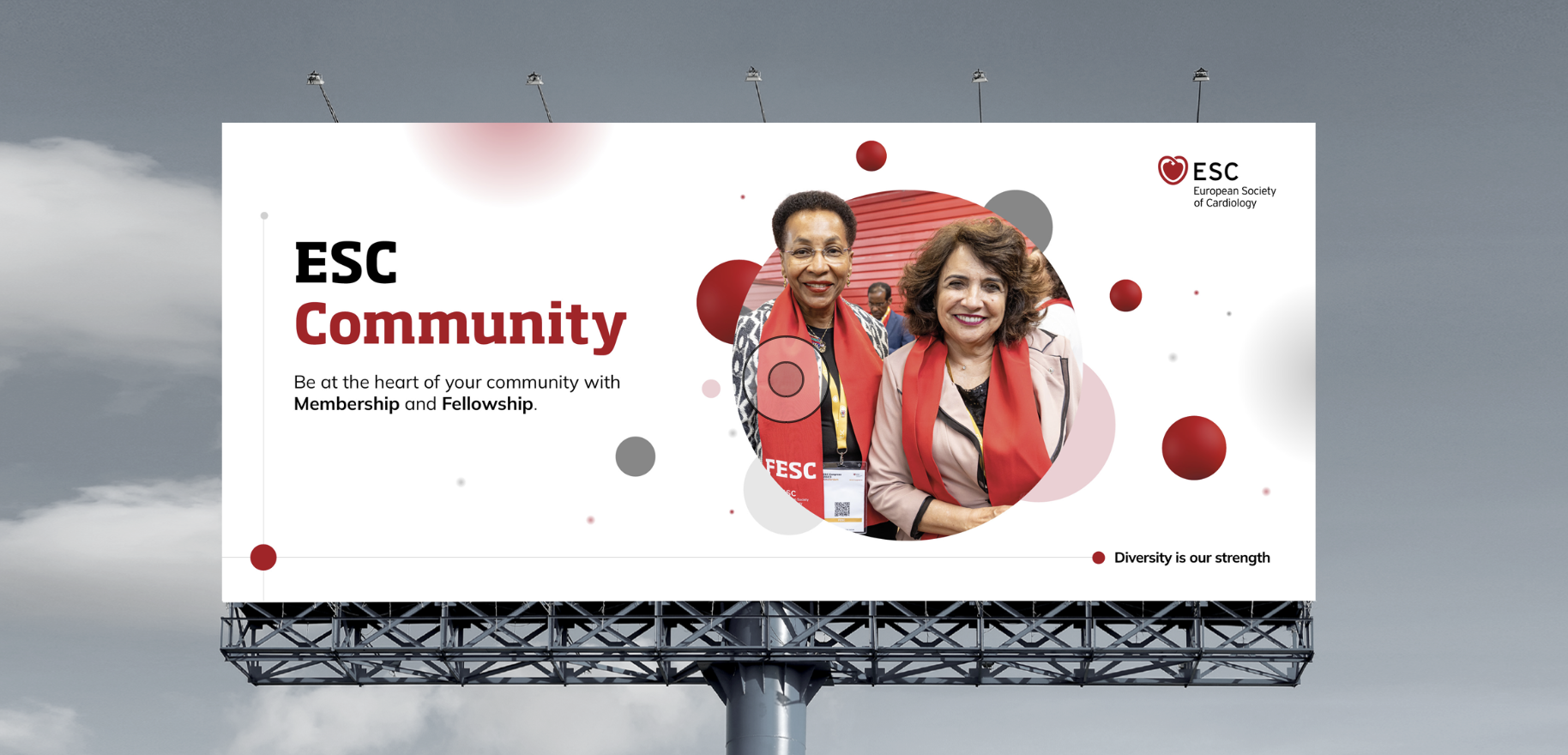
The system was designed to work beyond static artwork. Motion principles such as “Ambient” and “Connected” defined how the Cells could behave digitally, while application examples demonstrated how the identity should translate across infographics, printed materials, large-format signage, social media, digital banners and PowerPoint. I also created a consistent framework for ESC Associations, allowing each to introduce a distinctive accent colour while remaining visibly part of the wider ESC family.


The Process
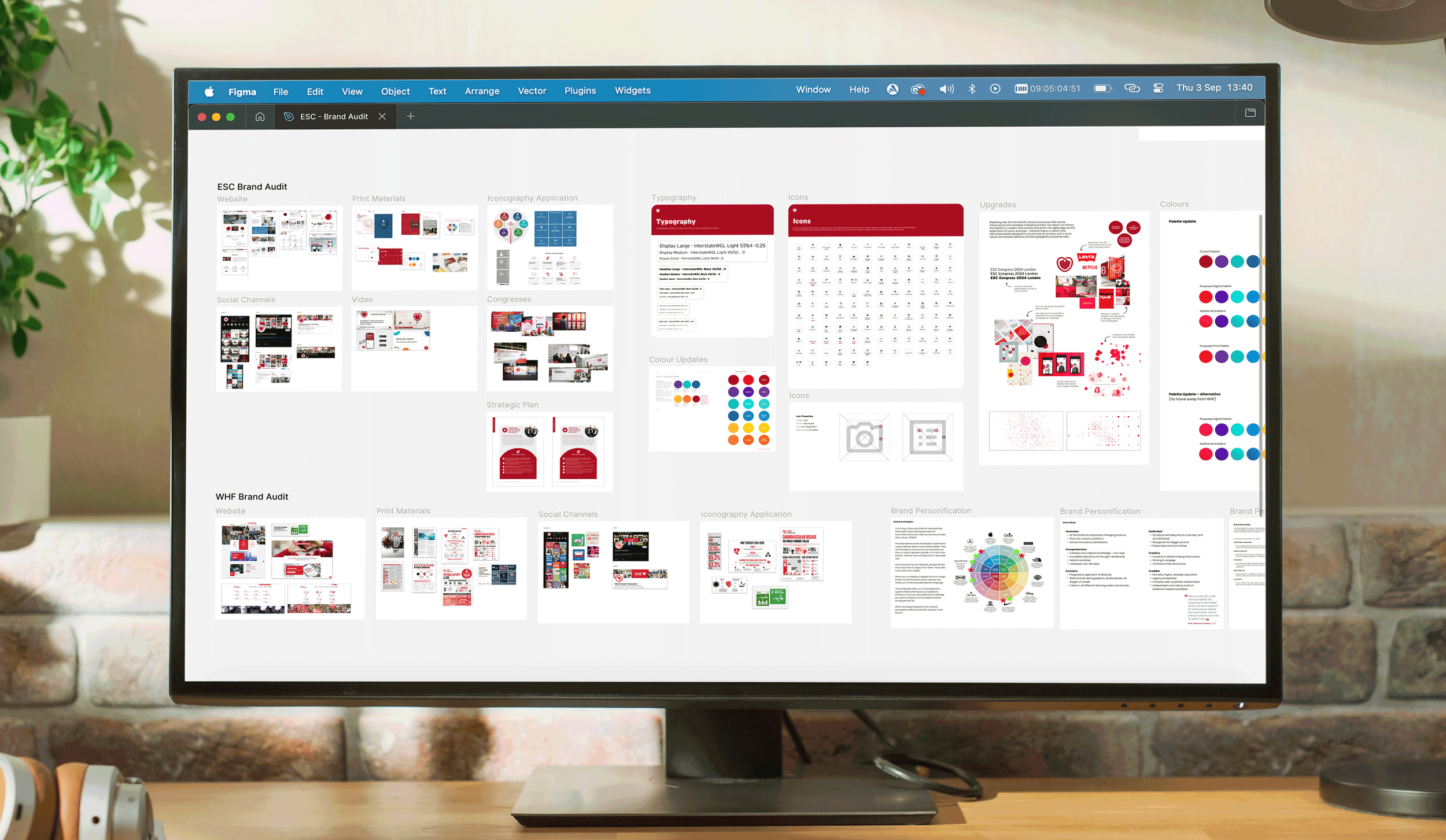
Audit of the existing ESC identity and brand architecture
Definition of visual principles and hierarchy
Development of the Cell and Cluster graphic system
Typography, colour and iconography rules
Photography strategy and image selection guidance
Motion principles and animation behaviour
Print, digital, social and presentation applications